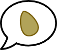
Designing the Nutshell Logo
Matt 20 May 2021 general
Brainstorming a Name
I was just looking at some old nutshell logo designs, and thought it might be interesting to share the progression.
The name “Nutshell” was the result of a brainstorm session. The name just seemed to suit the purpose of the app so well - We want to help you get to the point of a recipe, that is, recipes in a Nutshell.
Once a name has been decided, it’s easier to start drawing some designs.
How the Logo Developed Over Time
The first (cheap) attempt at a logo was using Font Awesome’s acorn , y’know, because it’s a nut. Sure, it’s a nicely modelled acorn, but it’s not very original to simply use an existing icon, and lord knows I need to agonise over details for way longer than this
Now, I don’t cook with acorns, so the nut itself didn’t really make sense. My rookie-level Affinity Designer skills led me to drawing an almond - Easy shape and I do eat almonds. Eagle-eyed readers may notice that the almond is not quite symmetrical. I just think it looks better with a slightly organic asymmetry as opposed to a super mathematical perfect shape

Almonds are kinda wrinkly, so maybe it could use some stylised texture?

Nope, don’t like the texture, but it does need more colour, what colour makes more sense than a shade of, not brown, but almond

Waitaminute! Nutshell is about skipping over the wordiness of recipes - Let’s incorporate “talking” into the logo. I think we’ve got our logo

To my eye, pink just seemed to belong with the almond shade. I’m a font collector, and Comicraft’s Metcon Scaled looks pretty great here:
